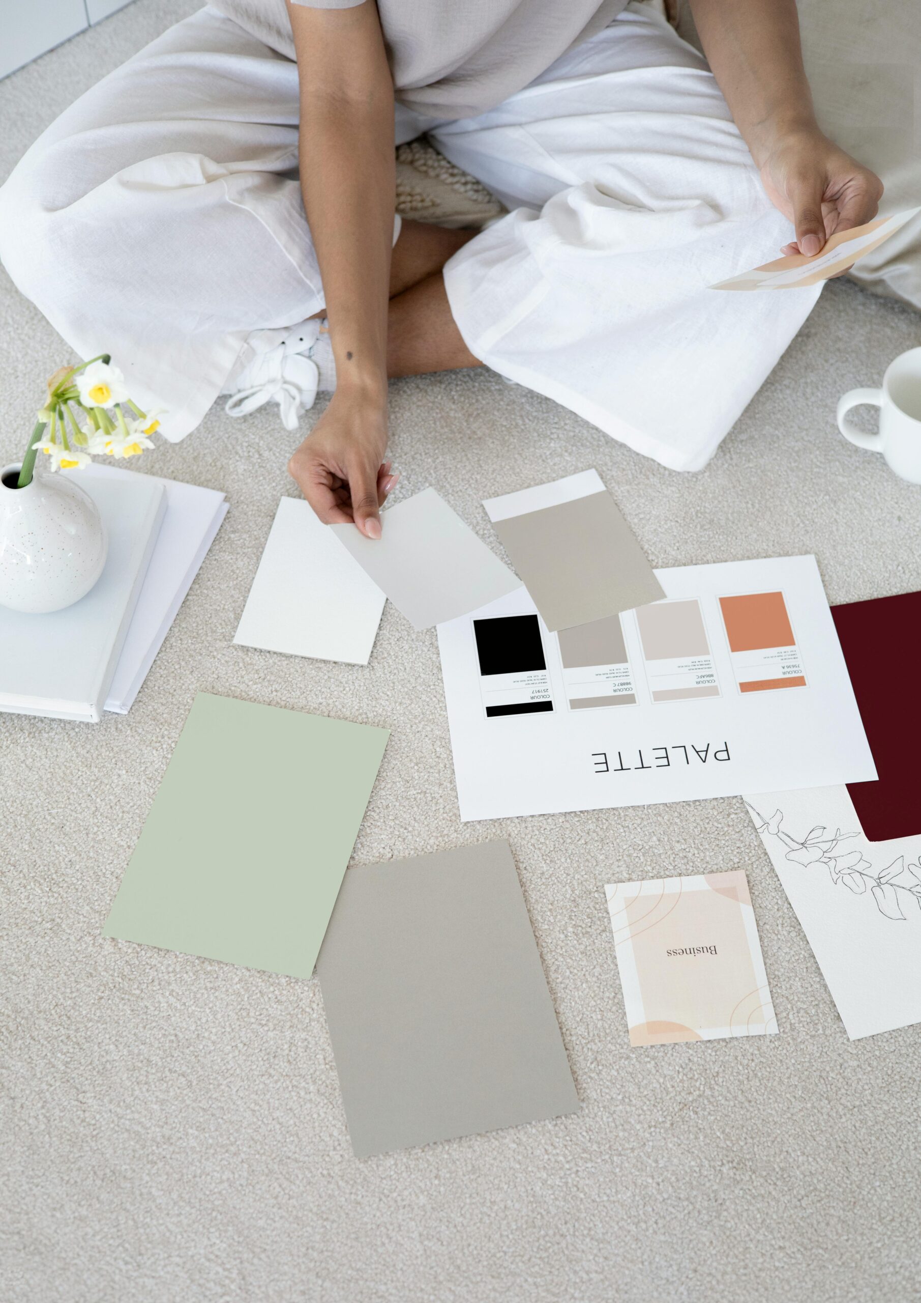
If you think brand colors are just about looking polished, think again. In the world of travel, where emotion, trust, and experience are everything, your color choices speak volumes before a single word is read or an itinerary is opened.
Color has a deep psychological impact on how your brand is perceived. It taps into subconscious emotions and behaviors that can either draw a potential client in or quietly push them away. Especially in the travel industry, where clients are making emotionally charged decisions and investing thousands of dollars, color becomes more than just a design choice. It becomes a strategic business decision.
Color Theory and Travel Buyer Behavior
To make smart color choices, you first need to understand how colors work together. Color theory is the foundation. It focuses on how hues interact within different types of palettes, including:
- Complementary palettes (opposite colors on the wheel) create bold, high-contrast combinations.
- Analogous palettes (colors next to each other) offer harmony and a sense of ease.
- Triadic palettes (three evenly spaced colors) strike a balance between contrast and cohesion.
Once you grasp these basics, you can begin using color not just for aesthetics but for strategy. Travel is an emotional purchase, and color plays a critical role in setting the right tone. For instance:
- Blue builds trust, signals calm, and conveys professionalism. This is why high-end travel brands and cruise lines often lead with it.
- Green evokes peace and balance, making it ideal for wellness travel or eco-focused adventures.
- Yellow and orange energize your audience. These cheerful, optimistic colors work well for adventure-focused or youth travel services.
- Purple adds a sense of luxury and creativity, which is perfect for VIP or custom-curated itineraries.
- Black and white communicate sophistication and timeless style. Many boutique agencies use these neutrals to keep their branding modern and editorial.
When you apply these insights to your brand visuals, you start shaping how your audience feels, and how they act.
Why a Thoughtful Palette Matters
Color selection is not just about choosing what looks good. It’s about crafting a visual experience that reflects your business goals and values. A strong brand palette includes a smart mix of:
- Anchor colors: These core hues appear most frequently across your logo, website, and branded materials.
- Supporting colors: These secondary tones create variety and balance without overwhelming your design.
- Accent colors: These bold or bright tones help guide attention to key elements like call-to-action buttons or important headlines.
By using these categories intentionally, you create a cohesive and memorable brand. This consistency builds trust, boosts recognition, and tells your story more effectively.
Three Takeaways to Help You Choose Colors with Confidence
1. Use emotion to guide your color choices.
Travel decisions are emotionally driven. Color evokes specific feelings, so make sure yours match the vibe you want your audience to feel, whether it’s calm, excited, nurtured, or inspired.
2. Align your palette with your promise.
Your colors should reflect what you offer. If your services are upscale and personalized, your visuals should feel refined. If you cater to adventurous travelers, your colors should feel bold and fun. Let your brand personality shine through every shade.
3. Don’t chase trends.
Just because a color is popular doesn’t mean it belongs in your brand. Choose shades that align with your message and speak to your target audience. A timeless palette rooted in strategy will serve you far longer than a trendy one.
Want to See It in Action?
During the session, several real-world examples were shared from travel brands like Go With Gray Travel and Abby Away Travel. Each one used color strategically to match their brand promise and elevate the client experience. From soothing, grounded tones for high-touch luxury clients to vibrant, playful palettes for adventure-focused travelers, each case showed just how impactful the right color choices can be.
Branding is not just about standing out. It is about standing true. And color is where it all begins.
Ready to take your visuals to the next level? Visit smeusestudio.com for tools, guidance, and support.


Comments +