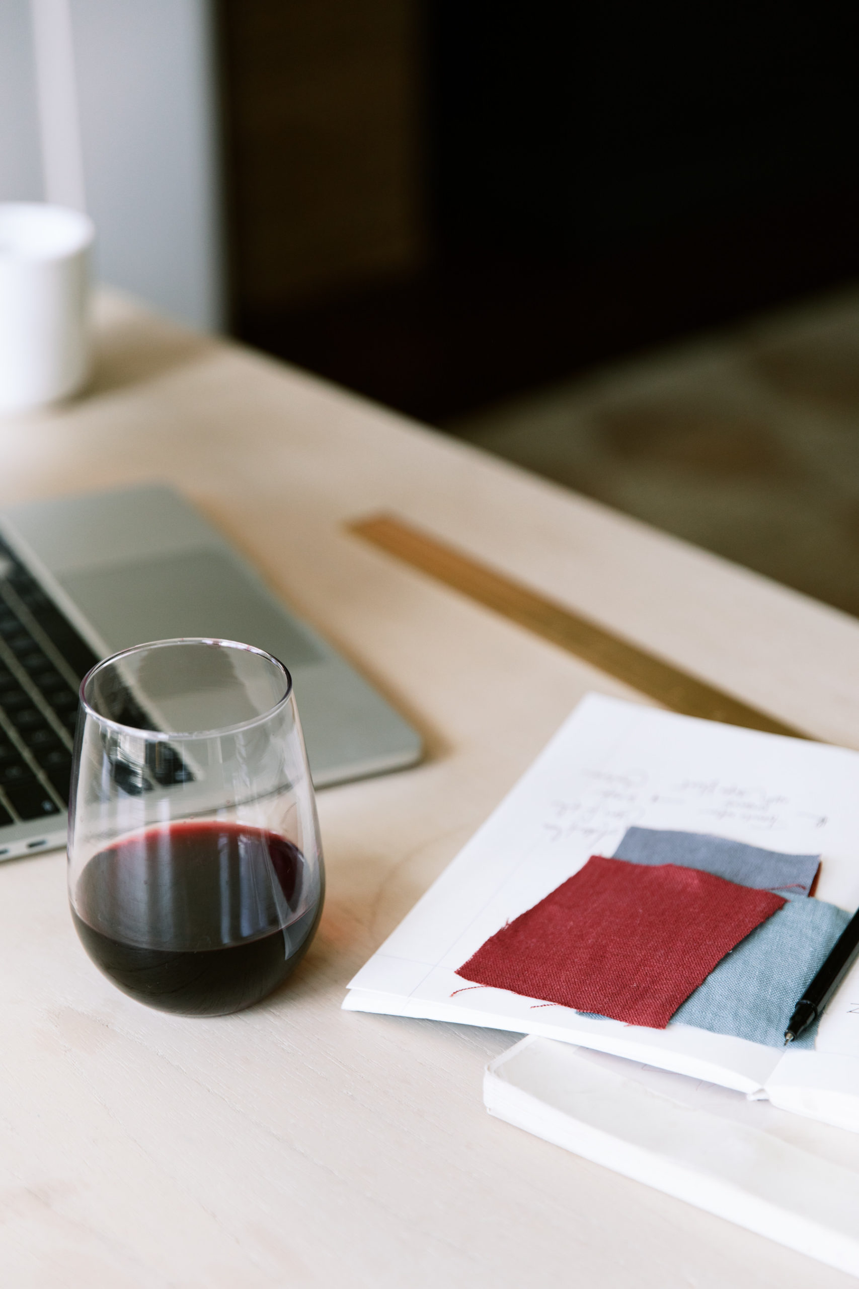
Creating a brand sounds pretty easy, right? Pick out some colors, select fonts, and have someone design a logo with your name in it.
While you can take a simple approach to your branding, the process of a professional creating a brand is any but simple.
Tique specializes in taking a mere concept and transforming it into a grouping of information that ends up creating the entire interpretation of your company through our custom branding service. In this episode, we share the specific components that make up what we know as a “brand kit” and design principles that are her guiding light through the process.
Be Authentic To Yourself (& Your Team)
The number one goal of a “good brand” is to create a brand that’s authentic to you & feels comfortable. Executing marketing is believable when it is authentic.
However, before you create a brand that is authentic to you, you need to also identify your target audience and if your brand will be representing you, or multiple team members. One thing we tend to see is that entrepreneurs start their company with themselves in mind, and don’t think about how the brand will also be representing someone else.
If you want help in defining your target audience, we recommend completing our free “Client Avatar “Defining Your Dream Client” worksheet HERE.
What Is In A “Brand Kit?”
- Logo: The main is the face of your brand, the star of the show.
- Alternate logo: The alternate logo is a different take on your logo and is generally a different shape than your main logo.
- Icon: The icon logo is a small symbol or typographic design that is best used in applications that don’t have much room or need a very small design.
- Fonts: You receive a type suite, which is a collection of fonts to use for your brand. A type suite also offers guidance on how fonts should be used.
- Color palette: Our palettes include 6 colors, some main colors, and some accent colors. When you get a color palette you receive the corresponding hex codes, which are alphanumeric codes that create a specific color in computer programs, like a website builder or in Canva.
Graphic Logos vs. Font-Based Logos
Depending on your brand, you will want to evaluate what type of logo you are looking for. It’s best to research brands that your target audience is naturally drawn to and evaluate their logos. For example, if you are solely working in the high-end/ luxury travel space, you’ll want to evaluate brands like Dior, Chanel, Louis Vuitton, and so on. If you notice, all of these high-end brands rely on fonts, not graphics.
How To Mix And Match Fonts
We recommend selecting three fonts: one for the heading, one for the subheadings, and one for the body copy. On certain occasions, it’s appropriate to select a fourth font for accents and calls to action, but the general rule of thumb is to work with only three.
Combining fonts with contrast is key. For example, designer Amandolin Webb refers to selecting a sans serif font that looks great with a serif font or a bolder font in conjunction with a lighter-weight font.
Simplicity is key. Crazy/ decorative fonts can be fun, but they tend to be a trend and won’t stand the test of time. Branding is a big investment and you don’t want to splurge on a brand kit that will fade within the next year or so, resulting in needing a rebrand sooner than later.
Type hierarchy is another thing to keep in mind – our eyes are drawn to the largest text on a page first then we kind of go down the list in descending order. With that in mind, we can use type hierarchy to grab someone’s attention in a particular way.
Most importantly, once your fonts have been decided, always use them in the same type-case, spacing and location every time. You’ll want to always use your header fonts as the header, and you will only want to use your accents fonts as accents. It may sound simple, but it’s easy to deviate from the pattern.
Color Pyschology
Selecting colors from your brand is a lot deeper than just picking your favorite colors and calling it a day. Each color has a different feeling and different qualities associated with it. Color psychology is fascinating and gives us the ability to select colors for our brand that are going to align with your ideal clients.
You can easily find a color psychology wheel online, but we’ve outlined a few below:
Red is said to represent passion, urgency, and action. We often see red used by fast food brands, actually, and it’s because they are playing on that sense of urgency and wanting people to take action.
Blue is said to represent calm, trust, confidence, and peace. We often see blue in corporate settings, especially in tech companies. They want to create a feeling of trust and confidence.
Green is said to represent health, growth, and safety. As a result, we often see green used in branding for athletic or leisure companies, banks, and of course any company that relates to the environment.
Color psychology gets extremely intricate and we highly recommend reviewing meanings of colors before defining your brand.
We’d love to know how this helped you in defining your brand! Please drop your questions or comments below.


Comments +